Helping Uber drivers arrive prepared and start earning
Before prospective Uber drivers could start earning, they needed a vehicle inspection. Product had identified this as the largest source of abandonment in onboarding.
The existing experience listed inspection locations but offered little guidance for choosing a provider or preparing for the visit. Drivers were unsure where to go, whether they needed an appointment, and what to expect.
I led the redesign, connecting preparation, provider selection, booking, and appointment management.
- Company
- Uber
- Role
- Product Designer, Lead
- Team
- Product, Engineering, User Research, and Product Marketing; led a junior designer as a design pair
- Project length
- 3 months
- Vehicle inspection completion
- +72%
- First-trip completion
- +39%
- Time to first trip
- 22% faster


The redesigned inspection flow
Tap the highlighted spot on the screen, or choose a step.
Step 1 of 10: The requirement and next step
TL;DR
Vehicle inspection was the largest source of abandonment in Uber driver onboarding. I led its redesign, connecting preparation, provider selection, booking, and appointment management.
- Visited an inspection center and watched drivers arrive unprepared and get turned away, which made preparation a priority in the design.
- Organized the journey around four moments: understand the requirement and prepare, compare providers, arrange the visit, and return to onboarding.
- Created an experience rhythm and reusable modules built on Uber’s existing components.
- Owned UX, UI, and content strategy and made product decisions with the PM. Led the project with a junior designer as a design pair, mentoring them throughout.
Key decisions
- How much guidance belongs up front?
- I separated the explanation into layers.
- Recommend a hub or let drivers choose?
- I made the recommendation explicit while keeping alternatives available.
- Keep the experience consistent when providers differ?
- I kept the information structure consistent while adapting the content and actions to each provider.
- Finish at confirmation or support the return?
- I gave drivers a persistent place to review the appointment, make changes, and check their onboarding status.
- Vehicle inspection completion
- +72%
- First-trip completion
- +39%
- Time to first trip
- 22% faster
The problem
A list of locations left important questions unanswered
The inspection step showed places drivers could go, but provided little help beyond that list. There was no recommendation, no FAQ, and no preparation information.
Drivers still needed to work out which provider suited them, whether they could walk in, and what they needed before leaving home.
Those gaps had consequences beyond the app. An inspection required time, travel, and coordination with a physical location. Missing information could mean an unsuccessful visit and another delay before earning.
- Inspection locations
- Which provider suits me?
- Can I walk in?
- What do I need before I leave home?
Research
Drivers were making the trip and still getting turned away
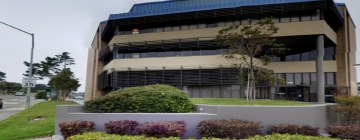
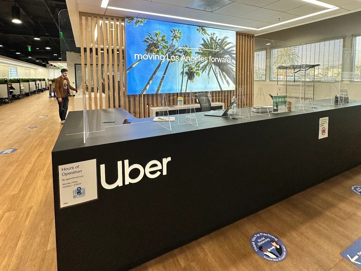
I visited an inspection center to observe what happened after drivers left the app.
I watched people arrive unprepared and get turned away. Some had spent an hour in traffic getting there. They were angry that they had made the trip and still couldn’t move forward.
That visit made preparation a priority in my design. Before asking someone to choose a location, the experience needed to help them understand what a successful visit required.
Research captured the same uncertainty:
“I was excited to start driving for Uber, but when it came time for the vehicle inspection, I had no idea where to go or whether I needed an appointment. The lack of guidance was frustrating, and it really slowed me down.”
Approach
Design around the visit, including the time outside the app
I organized the journey around four moments:
- 01Understand the requirement and prepare.
- 02Find and compare inspection providers.
- 03Arrange the visit and confirm the details.
- 04Return to the appointment and remaining onboarding steps.
This helped me account for the pauses between interactions. A driver could choose a location today, attend several days later, and return to onboarding afterward.
I worked with the PM to make decisions about scope and behavior, and with Engineering, Research, and Product Marketing to develop the experience.
- Understand and prepare
- Find and compare
- Arrange the visit
- Return
The solution
Explain the requirement before the location search
I designed the opening screen to explain why an inspection was required and introduce the available options.
FAQs answered questions about the process. A separate inspection checklist let drivers review what would be checked and prepare their car before traveling.
The opening stayed focused, and the detail was a tap away. Drivers knew the next step and could prepare before committing to a visit.


The requirement, a checklist and FAQs
Tap the phone to go through it yourself.
The solution
Make provider differences visible
Greenlight Hubs offered inspections alongside account setup and onboarding support. Drivers who visited these locations had higher success rates on the platform, so I recommended hubs where they were available.
I kept third-party providers visible and surfaced details that could affect someone’s choice: distance, cost, opening hours, and appointment or walk-in availability.
Provider pages carried that information forward. Drivers could evaluate their options and understand how to arrange a visit before making the trip.
Finding a nearby provider
Tap the phone to go through it yourself.
The solution
Help drivers arrange a visit and return to it
Where booking was supported, drivers could select a date and time, review their choice, and receive confirmation.
The appointment view kept the date, time, location, and visit details accessible, with options to change or cancel. Preparation guidance remained available before the trip.
I connected this view to the account-status experience, where drivers could see the appointment alongside other onboarding requirements. They could return to what they had arranged and understand what remained outstanding or in review.
From booking to account status
Tap the phone to go through it yourself.
What I wrestled with
Tension
The field visit made the need for preparation clear. But putting every requirement and possible question on the opening screen would make the next action harder to find.
Decision
I separated the explanation into layers. The opening established the requirement and next step. FAQs addressed common questions. The checklist supported preparation.
Trade-off
I kept the first step manageable while preserving access to the detail that could prevent a wasted trip.
- Requirement and next step
- FAQs
- Checklist
The guidance in layers: the opening, its FAQs, and the checklist Tension
Greenlight Hubs offered more support, but they weren’t necessarily the most convenient option for every driver.
Decision
I made the recommendation explicit while keeping alternatives available. A driver could weigh the additional support against practical considerations such as distance, cost, and schedule.
Trade-off
That allowed us to guide the choice without assuming the recommended location would work for everyone.
- Provider results
The hub recommended first, with other inspection centers listed below Tension
Some locations supported appointments, others accepted walk-ins, and costs and services varied.
Decision
I kept the information structure consistent while adapting the content and actions to each provider. Drivers needed to see those differences before deciding where to go.
What I learned
The design needed to represent the service accurately. A familiar layout was useful only if the details helped someone plan the actual visit.
- Greenlight Hub
- Third-party provider
One structure, adapted to each provider Tension
An appointment could be days away. Reaching confirmation didn’t mean someone was ready for the inspection or would remember the details later.
Decision
I gave drivers a persistent place to review the appointment, make changes, and check their onboarding status.
Trade-off
That extended the experience beyond arranging the visit to supporting the time between booking and attending.
- Confirmed
- Appointment
- Account status
Confirmation, then a place to come back to
System
Give each interaction a clear job
I created an experience rhythm to define four roles an interaction could play:
- 01Set expectations: Explain what will happen and what is required.
- 02Make a recommendation: Help someone choose a next step.
- 03Acknowledge progress: Confirm what has been completed or arranged.
- 04Resolve a problem: Offer guidance when someone is uncertain or unable to continue.
I used the framework to review the journey and identify where support was missing. It also gave the team a shared way to discuss what each screen needed to accomplish.
- 01
Set expectations
The introduction says why an inspection is required and how to prepare.
- 02
Make a recommendation
Provider results help drivers choose, with a hub recommended where there is one.
- 03
Acknowledge progress
Confirmation and status show drivers how far they’ve come.
- 04
Resolve a problem
Supporting content answers the questions that could otherwise stall progress.
- ↺ and back to the start for the next step
System
Define patterns the team could reuse
I defined modules for recurring needs such as explaining a requirement, presenting a location, and showing status, using Uber’s existing components.
The modules gave the inspection flow a consistent structure and provided patterns that could be applied to similar onboarding requirements.
I led the project with a junior designer as my design pair. They organized feedback from design critiques and set up the user testing. I guided what to prioritize and which feedback to act on, and worked with the PM to turn those discussions into decisions.
- Inspection introductionExplaining a requirement
- Provider resultsPresenting a location
- Account statusShowing status
Results
A complete inspection journey
The redesign shipped as one connected flow inside onboarding: preparation guidance, provider comparison, booking, and appointment management.
Drivers could review the requirement, understand their options, arrange a visit where booking was supported, and return to their appointment and account details.
Outcome
Results
- Vehicle inspection completion
- +72%
- First-trip completion
- +39%
- Time to first trip
- 22% faster
- Inspection locations
- Which provider suits me?
- Can I walk in?
- What do I need before I leave home?
- Which provider suits me?
- Can I walk in?
- What do I need before I leave home?
Before: the inspection step, reconstructed from memory, with the questions it left unanswered
01 / 10Reflection
The experience continued after someone closed the app
The inspection-center visit changed how I evaluated the work. I stopped judging the flow only by whether drivers could get through it, and asked whether it prepared them for a successful visit.
Pairing with a junior designer taught me to lead through structure: they owned critique feedback and user testing setup, while I held the direction and the decisions with the PM.
The reusable modules and the experience rhythm gave the team a shared way to discuss what each screen had to do, so reviews were about purpose rather than taste.
On a similar project, I would make field visits part of the team’s process, not only mine, and follow drivers past inspection to their first trip.
The question I carry forward is what someone needs from the product before they leave it, and what will help them continue when they return.
Next case study
TestBox: Demo Creation Engine
Turning a demo marketplace into a demo creation engine for sales teams.