Helping drivers understand Uber Pro by experiencing its benefits
Uber Pro offered drivers rewards such as cash back on gas, tuition support, and additional trip information. Many drivers knew the program existed but didn’t understand how it worked or what they could earn.
I originated and led a two-week trial that gave eligible drivers access to selected benefits. I designed the introduction, activation, in-app experience, and recaps, connecting each benefit to the wider program.
- Company
- Uber
- Role
- Product Designer, Lead
- Strategy · System Design · Interaction Design · UI Design
- Team
- Product, Engineering, User Research, Product Marketing, Content Strategy, Driver Core, and Comms
- Project length
- 3 months
- Program comprehension
- +29%
- Program awareness
- +20%
- More likely to engage with Uber Pro after the trial
- 2.5×

From the offer to Uber Pro
Tap the highlighted spot on the screen, or choose a step.
Step 1 of 6: The offer arrives
TL;DR
Many drivers knew Uber Pro existed but didn’t understand how it worked or what they could earn. I originated and led a two-week trial that gave eligible drivers access to selected benefits, and designed the introduction, activation, in-app experience, and recaps, connecting each benefit to the wider program.
- Expanded an existing driver journey map, which showed that Uber Pro was missing from onboarding, from driving, and from the time between trips.
- Facilitated a prioritization workshop that chose driving as the place to start.
- Built the trial around Trip Duration & Direction, a benefit drivers could evaluate for themselves during a familiar task.
- Pitched the trial to Uber’s director of design and built support for it in critiques across the design team.
- Designed it as a sequence: Introduction → Activation → Experience → Weekly recap.
- Turned the sequence into a reusable framework: Introduce, Educate, Reinforce, Evaluate. It became the foundation for a formal driver education program.
- Comprehension rose from 62% to 80% and awareness from 75% to 90%. Trial participants were 2.5 times as likely to engage with Uber Pro afterward as the comparison group.
Key decisions
- How much to explain up front?
- I led with the reward image, one direct message, and a single action.
- Where should the explanation live?
- I kept the longer explanation outside that request.
- What if drivers miss the trial?
- I made activation clearer and added lightweight reinforcement during the trial.
- How much should we customize?
- I worked directly with those teams to fit the experience into their existing systems.
- Program comprehension
- +29%
- Program awareness
- +20%
- More likely to engage with Uber Pro after the trial
- 2.5×
Recommendation
“Nisa’s work directly impacted the successful global expansion of contextual educational experiences for Uber Drivers.”
The problem
Drivers knew the program existed, but struggled to see its value
Uber Pro organized benefits into tiers, with requirements for earning and maintaining access.
Baseline research showed 75% awareness but only 62% comprehension. Knowing the name didn’t necessarily mean understanding the rewards, the requirements, or why progressing through the program was worth the effort.
Much of that information lived in the Uber Pro destination. Drivers had to leave their current task and seek it out. The program had limited presence in the activities that made up their workday.
The design problem was how to connect Uber Pro to those activities so drivers could understand its value in context.
- Partner
- Gold
- Platinum
- Diamond
Research
Map the journey before choosing where to intervene
I started with an existing driver journey map and expanded it to examine onboarding, going online, driving, managing trips, and finances. I overlaid Uber Pro touchpoints and qualitative research findings. The map exposed gaps at several points:
- 01During onboarding: Uber Pro wasn’t introduced early.
- 02During driving: Rewards were disconnected from the work itself.
- 03Between trips and offline: Learning about the program required a separate visit to its destination.
I facilitated a prioritization workshop with Product, Engineering, and Design to decide where to focus.
We chose the driving experience. It was a frequent part of the journey, Uber Pro had little presence there, and we could introduce the program within tasks drivers already did.
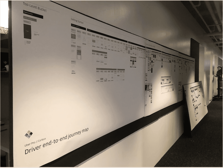
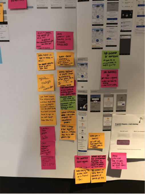
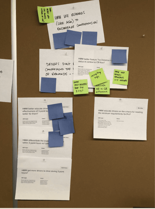
Driver end-to-end journey map, with Uber Pro’s presence overlaid
Hypothesis
Let drivers experience the value of the next tier
Giving drivers temporary access to a next-tier benefit could increase awareness of Uber Pro and help them understand what the program offers.
Trip Duration & Direction gave us a concrete benefit to test. It showed the estimated length and general direction of a trip before a driver accepted it. A request might say “22 min trip northeast,” helping drivers evaluate the offer.
Because the benefit showed up in a task drivers already did, they could judge its usefulness while they worked.
- A trip request with the reward
- 1.Additional trip information provided by the reward
The solution
A two-week trial, supported from introduction to recap
I pitched limited-time access to selected benefits to Uber’s director of design, and built support for it across the design team in critiques.
The experience needed to explain the offer, make activation recognizable, support use, and connect the trial back to program progress. I designed it as a sequence:
Introduction → Activation → Experience → Weekly recap
The two-week duration gave drivers time to encounter the benefit in their work. Weekly recaps let drivers review their progress and see what came next.
- Introduction
- Activation
- Experience
- Weekly recap

The solution
Make the offer recognizable from one screen to the next
Drivers needed to recognize that the benefit appearing in the app was the same one they had been offered.
I carried consistent wording and visual cues from the introduction through activation and use. The introduction explained the offer and its temporary nature. The contextual display identified the benefit within the trip experience.
I worked with Driver Core and Engineering to connect those states so the trial felt like one experience.
From the offer to the first trip
Tap the highlighted spot on the screen, or choose a step.
Step 1 of 5: The offer arrives
The solution
Show the benefit within the trip request
For Trip Duration & Direction, the request itself demonstrated what the benefit offered.
I designed the contextual display to identify the additional information as an Uber Pro benefit without repeating the full program explanation.
Seeing the feature in use gave drivers something concrete to assess: whether the information helped them evaluate a request.
The solution
Connect the trial to program progress
The trial showed what a benefit did. Progress screens showed how close the driver was to earning it through Uber Pro.
I designed indicators and check-in screens to connect current status, requirements, and the next tier, and worked with a content strategist on their copy. That gave the benefit a place within the wider program.
Weekly recaps reinforced this connection. They acknowledged participation and explained progress. Messaging also accounted for drivers on track to reach Gold, distinguishing the end of temporary access from benefits they could unlock through their status.
- Progress
- 1.Points toward the next tier
- 2.The trial’s status
- On track for Gold
- End of the trial

What I wrestled with
Tension
Drivers needed a better understanding of Uber Pro, but explaining every tier and requirement up front would make the trial harder to introduce.
Decision
I led with the reward image, one direct message, and a single action. The introduction focused on what drivers could try. Supporting screens explained how it worked, while progress and recaps connected the benefit to the wider program.
Trade-off
I distributed the explanation across the journey rather than asking the first screen to carry it all.
- Introduction
- 1.The reward image
- 2.One direct message
- 3.A single action
- How the trial works
- Recap
- 1.The reward image
- 2.One direct message
- 3.A single action
The introduction leads with the benefit; later screens explain the trial and connect it to the program Tension
Trip Duration & Direction appeared when drivers evaluated a request, a screen that already carried information they needed to process.
Decision
I kept the longer explanation outside that request. Within it, the design focused on the additional trip information and its connection to Uber Pro.
Trade-off
The introductory screens explained the benefit beforehand. The request showed it in use.
- Explained beforehand
- 1.The offer, and how the trial works
- Visible during use
- 2.Only the trip preview, in the request drivers already use
Explained beforehand
- 1.The offer, and how the trial works
Visible during use
- 2.Only the trip preview, in the request drivers already use
The detailed explanation stays outside the request; the request carries only the trip preview Tension
Testing showed that some drivers didn’t realize their trial was active. Making the reward available hadn’t been enough to communicate what they were receiving.
Decision
I made activation clearer and added lightweight reinforcement during the trial. Weekly recaps acknowledged participation, showed progress, and explained the next step.
What I learned
That finding pushed me to treat access, recognition, and understanding as separate parts of the experience.
- Go online to start
- During a trip
- Mid-trial message
- Halfway check-in
Activation, then reinforcement while the trial runs Tension
The trial depended on surfaces my team didn’t own. Driver Core owned the trip workflow, while Comms owned notification and inbox patterns.
Decision
I worked directly with those teams to fit the experience into their existing systems.
Trade-off
Established patterns limited some presentation choices, but helped us ship consistently without creating a separate interaction system for Uber Pro. I focused on preserving the sequence and meaning as the implementation adapted to each surface.
- Driver Core: the trip workflow
- Trial state built into the trip workflow
- Comms: notifications
- Activation through existing messaging patterns
Driver Core: the trip workflow
- Trial state built into the trip workflow
Comms: notifications
- Activation through existing messaging patterns
The trial inside the existing trip and messaging patterns
From feature to framework
Turn the sequence into a reusable framework
As I developed the trial, I organized the approach around four moments:
- 01Introduce: Present the benefit and explain the offer.
- 02Educate: Help drivers understand the benefit through its use.
- 03Reinforce: Keep the trial and its value recognizable while it is active.
- 04Evaluate: Review progress and explain what comes next.
This gave the team a structure for designing later reward experiences. Each moment had a purpose, while the interface could adapt to the benefit and the surface where it appeared.
The framework became the foundation for a formal driver education program at Uber.
01
Introduce
Present the benefit and explain the offer
02
Educate
Help drivers understand the benefit through its use
03
Reinforce
Keep the trial and its value recognizable while it is active
04
Evaluate
Review progress and explain what comes next
Recommendation
“Nisa’s work directly impacted the successful global expansion of contextual educational experiences for Uber Drivers.”
Outcome
Results
- Program comprehension
- +29%
- Program awareness
- +20%
- More likely to engage with Uber Pro after the trial
- 2.5×
67%
Uptake
Activated the trial
45%
Engagement
Used trial benefits
30%
Conversion
Worked toward rewards
- Partner
- Gold
- Platinum
- Diamond
The existing Uber Pro destination, showing tiers, requirements, and benefits
01 / 10Reflection
Mapping broadly helped me choose where to go deep
Mapping the full journey revealed opportunities beyond the Uber Pro destination. The harder task was getting the team to agree on which one to pursue first.
Looking back, I would turn that map into a shared decision record earlier: what we were prioritizing, why, and what we were deliberately leaving for later, so partner teams like Driver Core and Comms could see the reasoning behind each ask.
The trial depended on surfaces other teams owned. Access, recognition, and understanding each lived somewhere different, so success needed a definition every team shared.
Because the framework became the basis of a driver education program, I’d next want to know what lasted: whether understanding held, and whether drivers went on to earn and use the rewards.
Next case study
Uber: Driver Onboarding
Helping drivers arrive prepared and start earning.