WeTrust | Decentralized App
About the project
I pitched WeTrust, a cryptocurrency startup, and won the work to redesign their MVP. I was the only designer collaborating with WeTrust’s lead developer. Project was completed in 2 weeks (I hustled). Fun fact: I was paid in Ethereum!
About WeTrust
Bring decentralized banking services to the people in the world that don’t have access to bank accounts, forms of identification, and credit scores.
Do this by creating a platform where instead of using a “trusted 3rd party” like a bank or payday loan center, contracts self-execute with code.
How the MVP works: Every set period, users contribute to a pot. If one person has a need for the money, they bid for it. The person that wins the lowest bid gets what they asked for, and the rest of the contributions are spread to the group.
Design Pillars
After doing a heuristic evaluation of the current state, interviewing the WeTrust team, and studying at the competitive space, I came up with a 2 product design pillars.
1. Less work, more play: Experience should feel like an enjoyable activity to do with their community.
Current state is not usable for the average person.
UI needs refresh to reflect best practice.
Experience needs feel like an enjoyable activity to do with friends and family.
2. Actionable and simple: The user should feel like there is one thing to do, know where to start, and be able to anticipate next steps.
It should feel actionable and simple.
The user looks at something and know where to start, be able to anticipate next steps, and receive constant feedback.
Time is a significant element in blockchain technology, transactions don't happen instantly. This is a challenge to design for, as most of us are used to instant feedback.
Homepage dashboard
Design decisions
Overall:
Made the experience feel more inviting and dynamic.
Showed most relevant content where they were important.
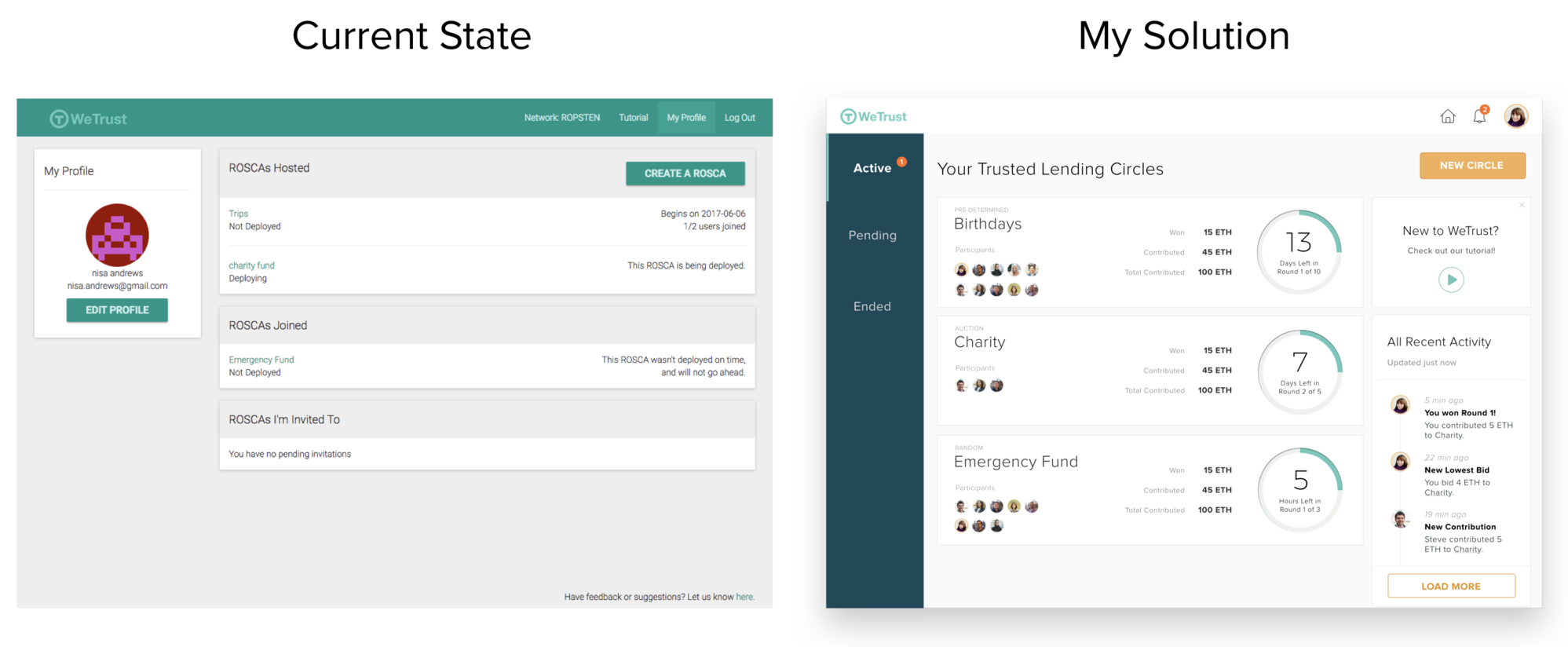
Current state vs my solution
'Edit profile' and 'create a ROSCA' compete with each other. I deemphasized “edit profile”, and tucked that action in the main navigation
Created a history center where the user could be able to see activity of all circles at a glance. This enhances the community feel.
Deprioritized showing all the different statuses of the circles at once, and instead created a tabbed navigation to reduce visual clutter and focus on the active circles
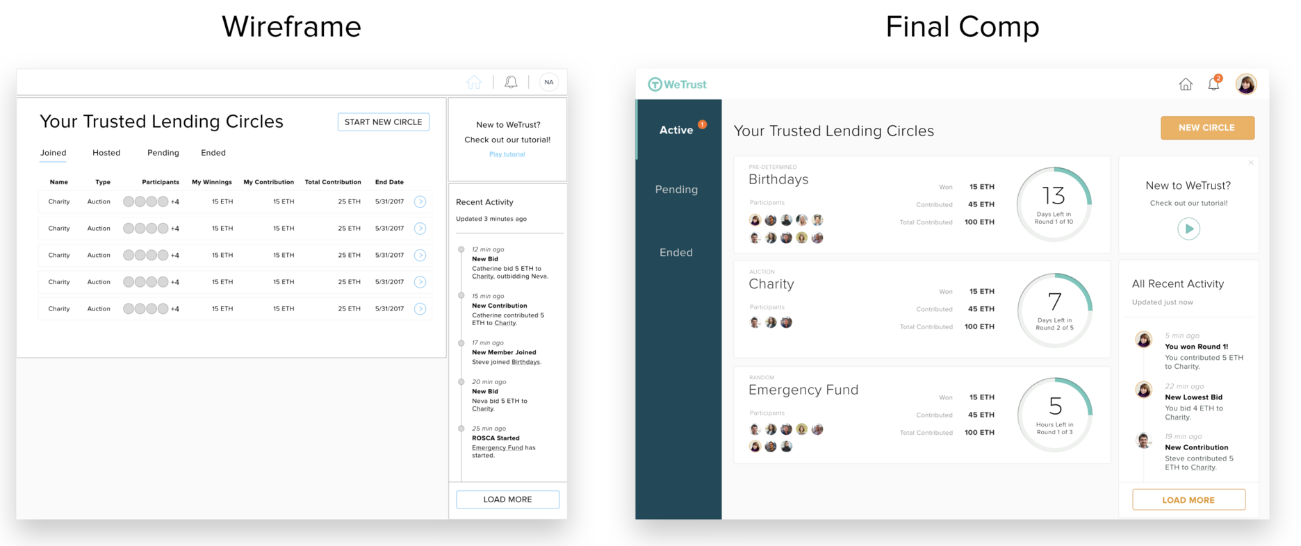
Wireframe vs final comp
Unpacked the most important details about a circle - how much the user has won, how much they have contributed, the total contribution, and how much time there is left in a round and gave it a dynamic visual treatment
Different weight for most important information: how much was won or contributed; time left in the round.
Create a circle
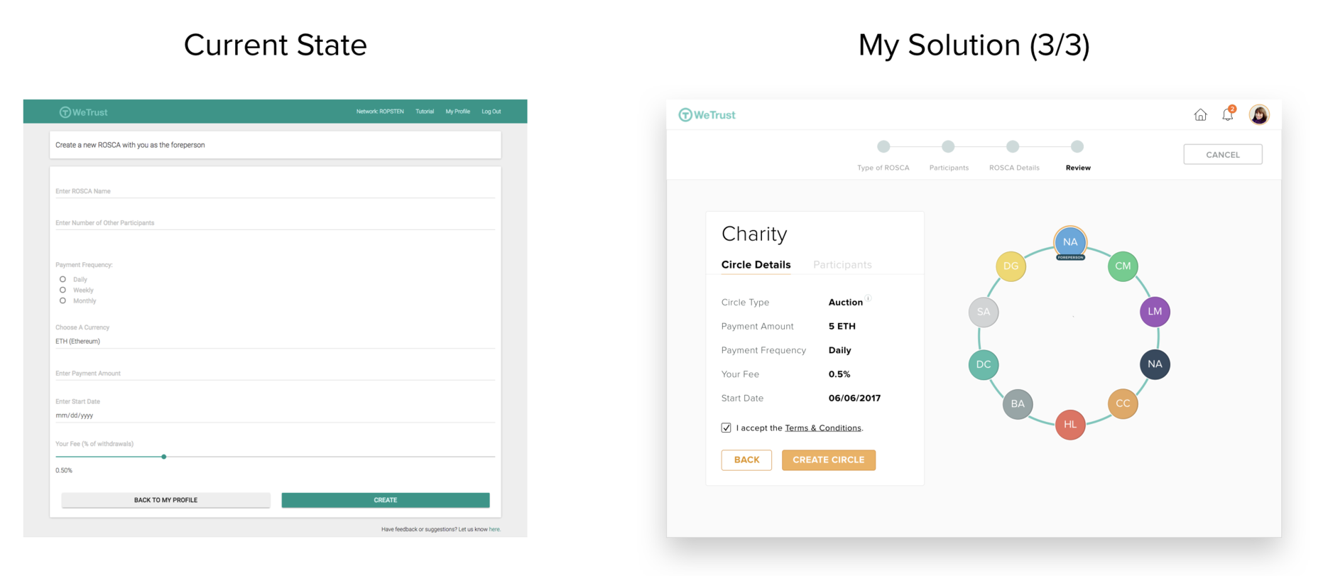
Design decisions
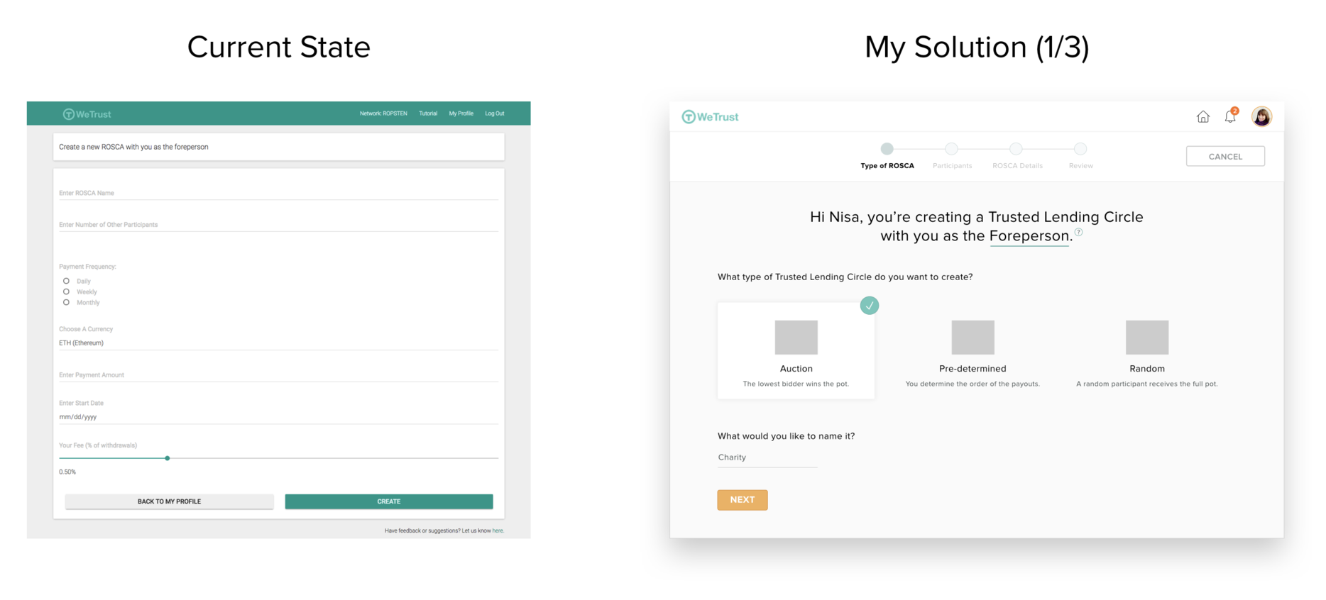
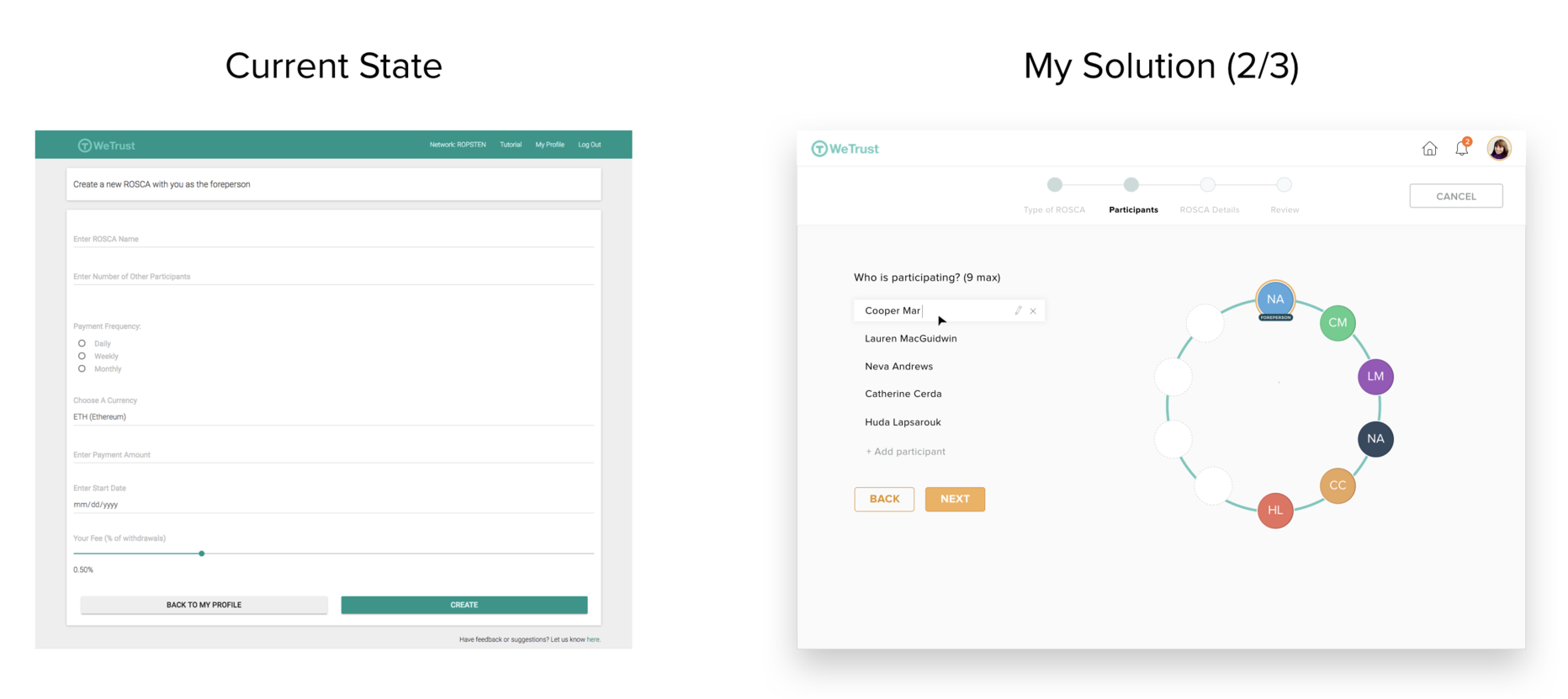
Overall, made the experience feel less like a form (since no one likes forms) and more like a conversation that was very visual.
(1/3) Anticipated where the user might need further help, and reduced that need by surfacing suggestions and definitions in order to create transparency & eliminate uncertainty
(2/3) In the current state you have to create a list. in my solution, the user creates their circle, which helps focus on the people aspect and overall creates a more engaging experience.
(3/3) In the current state, there is not enough room to correct mistakes. in my solution, the user confirms details before creating the circle.
Bidding dashboard
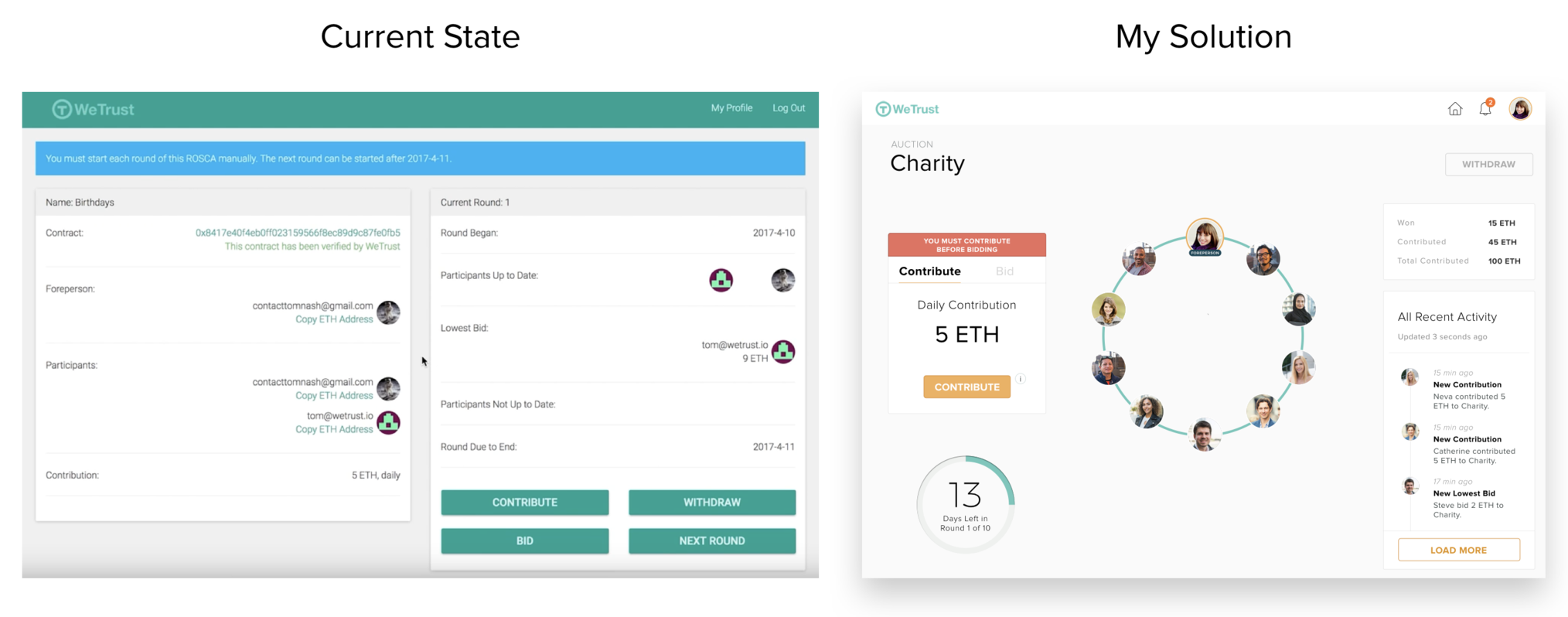
Design decisions
Current state vs my solution overall:
created consistency with the “trusted lending circle” design
better grouped related information together
improved the feedback mechanics
gave more visual contrast to most important information
Current state vs my solution details:
carried a consistent design throughout experience. made it feel more like a game and less utilitarian.
reorganized actions - all are grouped together but all have special times when to appear.
I disabled the withdraw button, since you cannot click on it until you actually win a round.
split the contribute and bid buttons, since you must contribute before you bid, i separated those buttons and gave direction to allow user to progress.
Feedback mechanics
created activity log with priority of notifications.
Users need to be notified of activity from other users in this circle whenever there is a new contribution, new bid, or have been underbid.
time until round ends
countdown should feel dynamic and add excitement to the experience.
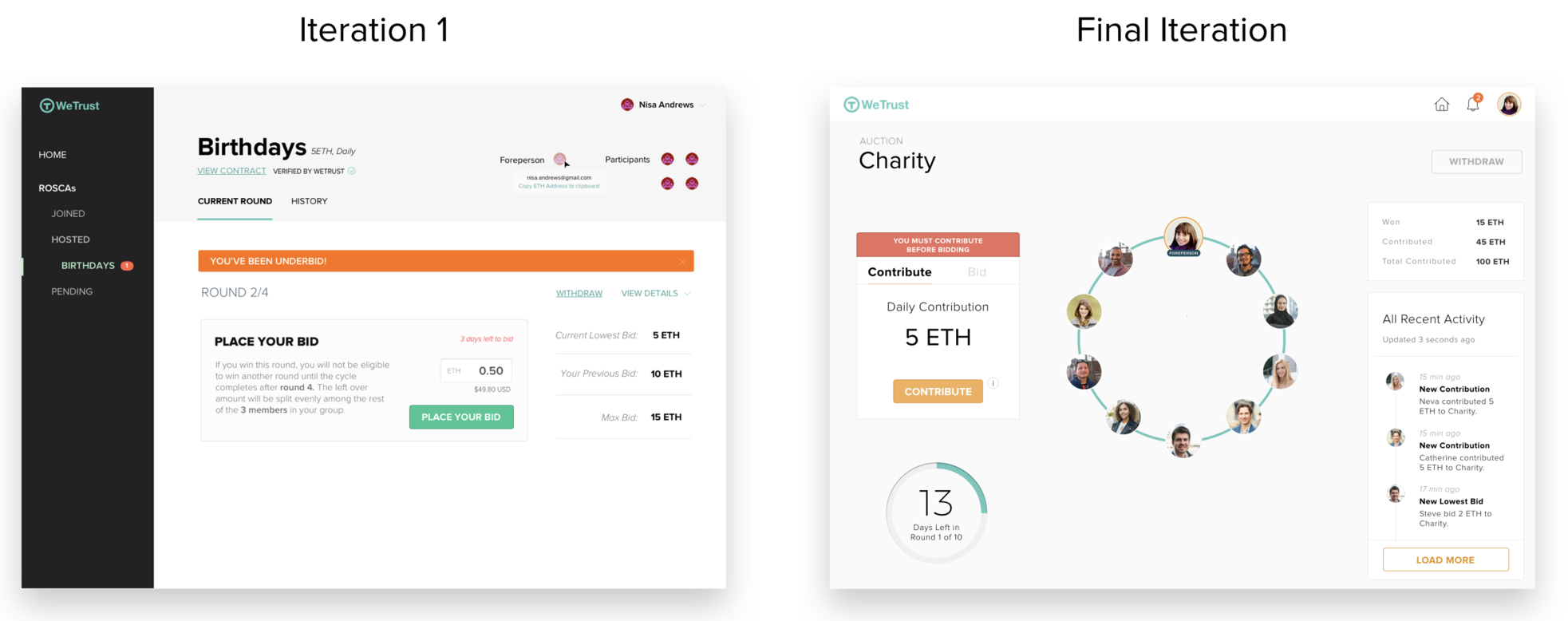
Iteration 1 vs final iteration overall:
made it more engaging, less utilitarian and like an accounting tool.
emphasized the community aspect more by using the circle.
chose a less noticeable and more practical primary navigation .
Iteration 1 vs final iteration details:
emphasized the members of the circle more, and visualized the “trusted lending circle”.
chose to use the primary navigation horizontally instead of docking it vertically.
horizontal bar looks better and seems simpler at a glance.
vertical bar is more practical if there are a lot of pages, which is an unlikely case.


